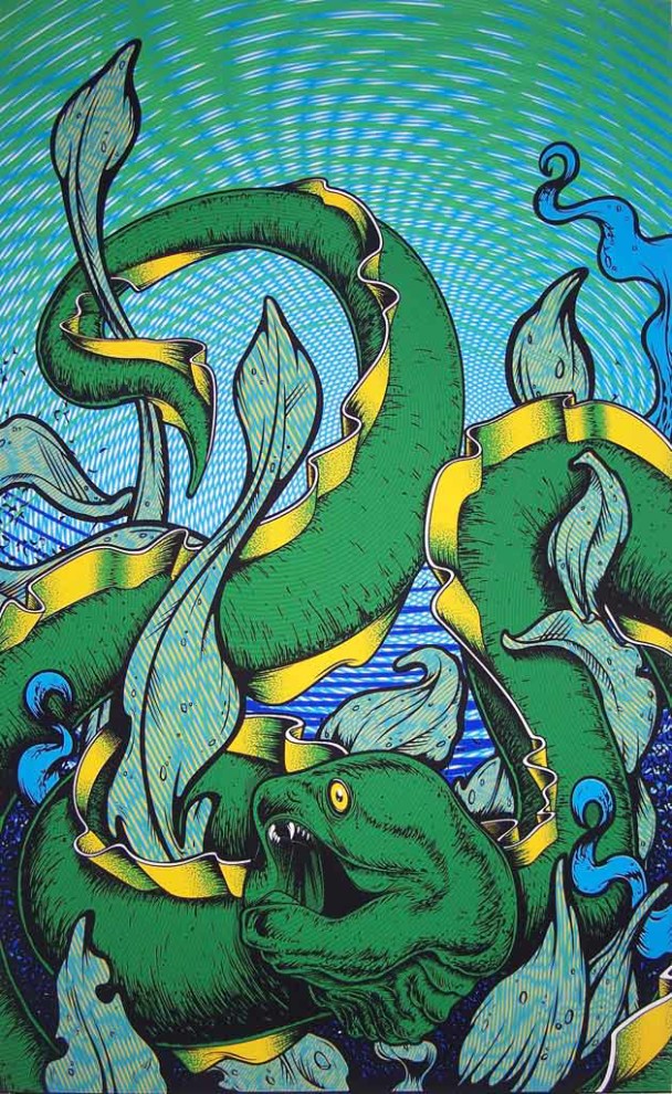
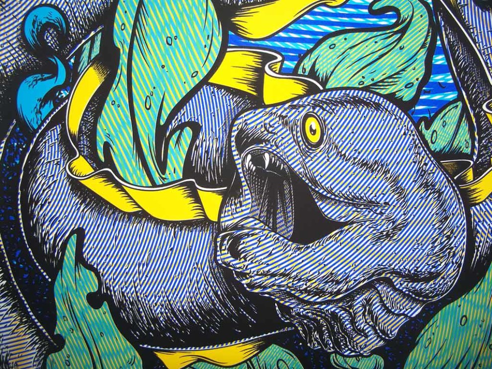
A pun-based piece that toys with the relationship between moray and moiré.
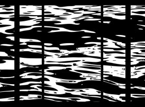
This piece attempts to explore some visual effects and moiré patterning. Typically, moiré patterns are undesirable in textile and printing industries, which result when similar patterns are slightly displaced or rotated from one another. However, by embracing these patterns, one can accentuate their effects within a design.
This portfolio features various stages of this project’s development. Listed below are some supplementary details.
- Final printed version of the image. 6-Color Silkscreen Print.
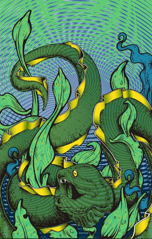
- Vector version of the image – This image provides a basis to how the image should have ended up printing. Perhaps using some stronger/more pigmented base colors, and transparency within certain inks, this image could have been achieved.
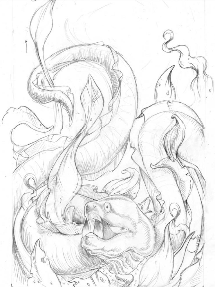
- Initial sketch of the design with some notes on improvements.
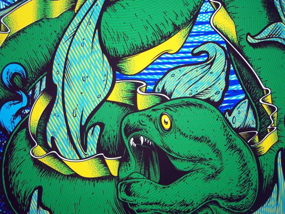
- Close up of final printed version.
- Close up of a phase test. This version shows some of the early moiré effects before the green layer masks a lot of these efforts. Thinning of the green ink, or a darker gold base value would have intensified the final result.

