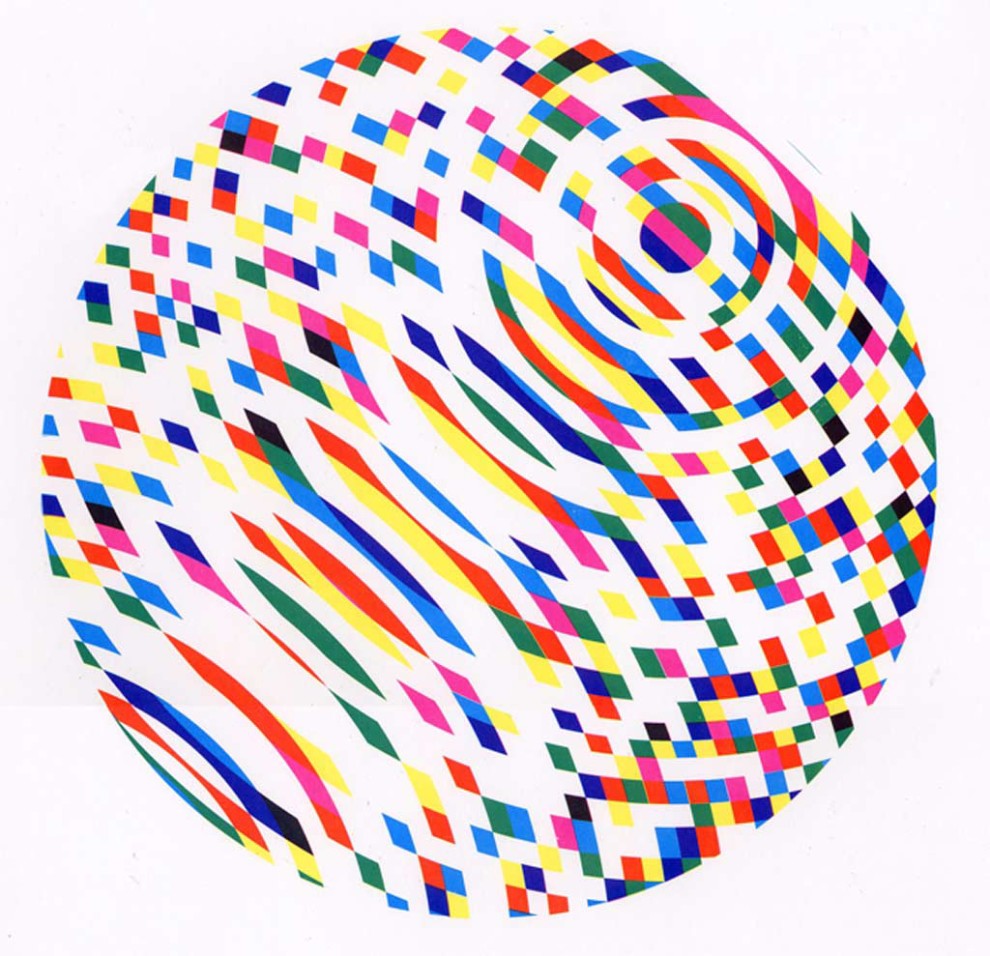
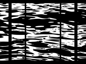
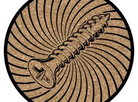
This image was created to simply explore some of the transparency effects and color overlays when using based-down process inks.
My initial vision was for this to be a larger image (30″+ diameter) and use more earthy colors. However, after this small scale study and some feedback from peers, I’ve opted to not go down that road. It seemed to evoke a lot of Star Wars Death Star comments, and even an AT & T logo reference. None of these ideas were my intended result, and I may have to rethink or alter this design down the road. An alternative version of this exists without the final black layer of the print. Unfortunately, I do not currently have any good scans of that particular image.

